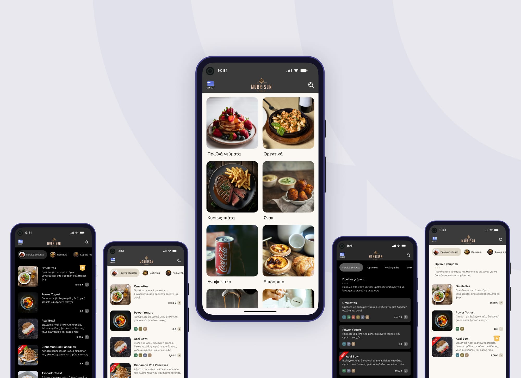
Wifi Catalogue: Elevating Hospitality Businesses
Streamline hospitality with Wifi Catalogue! Discover how a cohesive design system transformed QR menus into a seamless, efficient user experience.
Project Snapshot
- Company: Wifi Catalogue
- Product: QR-based menus and guides for hospitality businesses
- Role: Product Designer
- Focus Areas: Design System, Visual Design, Technical Alignment
- Highlights: Design System Creation, Developer-Friendly Implementation, Platform Polish
Problem & Context
As the hospitality industry rapidly shifted toward contactless experiences, Wifi Catalogue emerged with a timely solution—QR menus and digital guides for restaurants and hotels. While functional, the platform lacked visual consistency and polish. The design felt fragmented, and the interface didn’t reflect the product’s growing relevance and potential.
This project came at a critical moment: demand was rising, and the team needed to act fast. I joined to elevate the product’s visual language while ensuring any changes wouldn’t disrupt development. We had limited time, and a long dev backlog was not an option.
My Role
I led the design efforts, working closely with the founders to shape a new design system that improved the visual and functional quality of the product. I began by immersing myself in both the user experience and the codebase—understanding the platform’s strengths and limitations was essential to crafting designs that could be implemented smoothly. My goal was to deliver high-impact, low-friction improvements. Despite the short timeline, I made sure every decision pushed the product forward in meaningful ways.
Process & Approach
Laying the Foundation
My first step was a deep audit of the platform—color palettes, typography, layout structure, and component behavior. From this, I built a robust design system tailored to the platform’s needs and constraints. The system emphasized clarity, scalability, and elegance.
Collaborating with Developers
I reviewed the codebase early to ensure all proposed updates would align with existing structures. This allowed for smoother collaboration and faster implementation. I worked closely with the devs to iterate quickly, addressing edge cases and refining component logic as needed.
Designing for Growth
Every component was designed with the future in mind. Whether a small icon or a full layout, I made sure it could evolve as the product scaled. The system was modular and flexible—easy to maintain, and even easier to build on.
Outcome & Impact
The project delivered immediate and long-term value. The interface became more intuitive and visually cohesive, creating a smoother experience for customers. The design system made the development team faster and more confident in future rollouts.
This wasn’t just a visual upgrade—it was a foundational shift that helped Wifi Catalogue mature as a product. Even though the project was relatively short, its impact continues to shape how the platform grows.
Wifi Catalogue is at an exciting crossroads. With a strong design foundation established, the platform is well-positioned to explore new features and capabilities that further enhance value for hospitality businesses. The journey to innovate and deliver exceptional user experiences continues, and the future looks brighter than ever.

