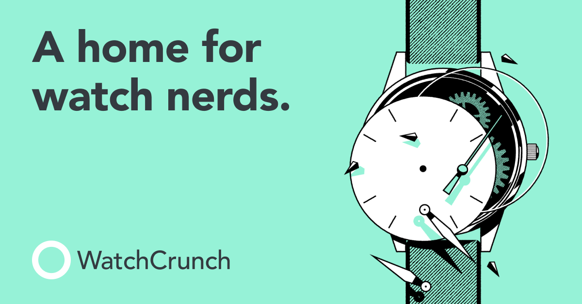
WatchCrunch: A Digital Haven for Watch Enthusiasts
WatchCrunch blends timeless design with modern usability, creating a vibrant hub for collectors to share, discuss, and celebrate their passion.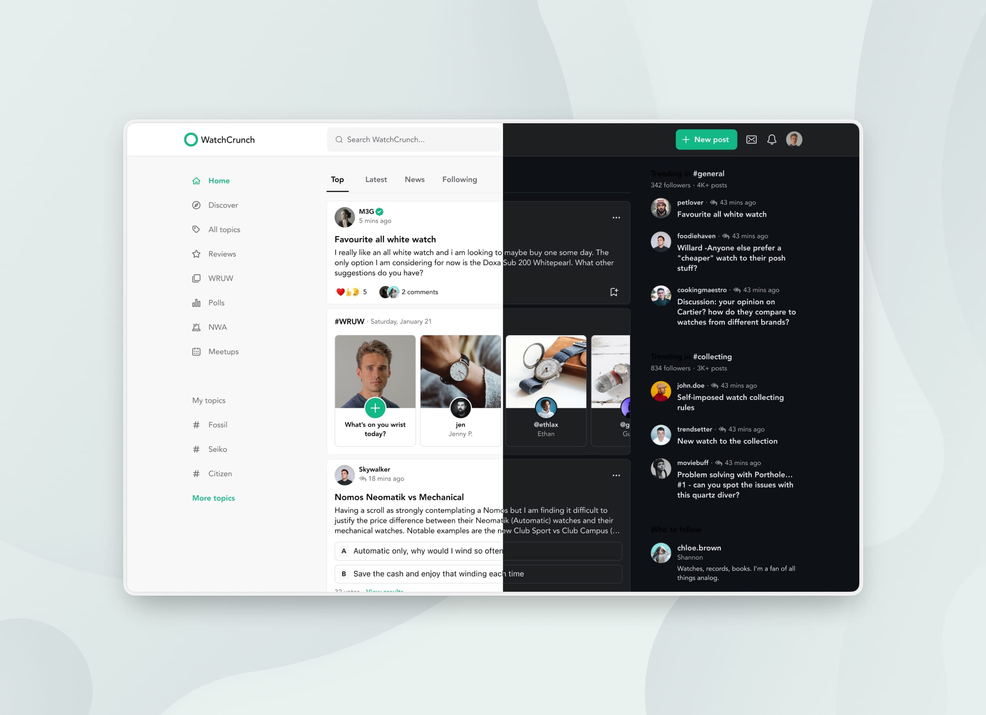
Project Snapshot
- Company: WatchCrunch
- Product: WatchCrunch (iOS, Android, Web)
- Role: Product Designer
- Focus Areas: Mobile-first Design, Design Systems, Cross-Platform Consistency
- Highlights: iOS & Android App Design, Design System Creation, QA & Dev Collaboration
Problem & Context
WatchCrunch is a niche social platform for watch enthusiasts, aiming to combine the elegance of luxury timepieces with the usability of a modern digital experience. When I joined the team, their web platform was already live and serving thousands of daily users.
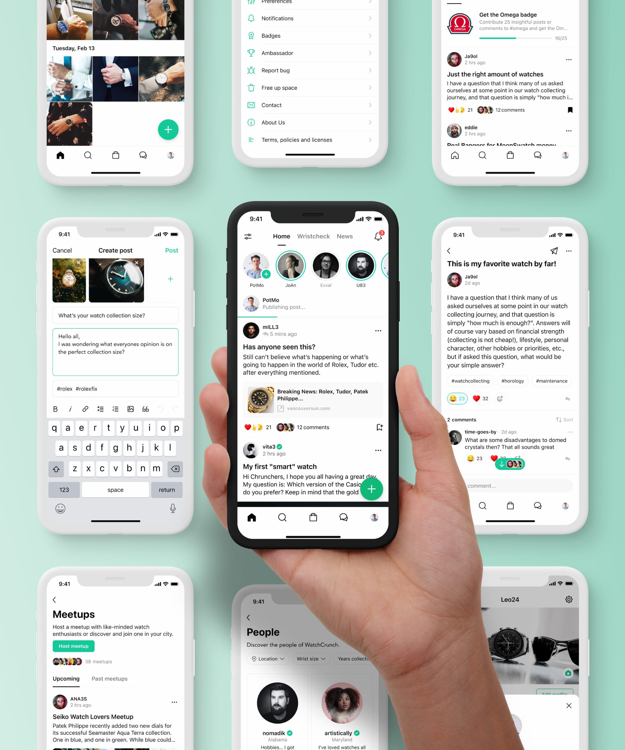
My mission was clear: bring that experience to mobile—design world-class iOS and Android apps that felt as timeless and refined as the community they served.
My Role
As the sole product designer on the team, I led the design efforts across all three platforms. My responsibilities included setting up a scalable design system, designing and adapting features for mobile and web, collaborating closely with developers, and ensuring pixel-perfect QA across every release.
Even with a small team, we aimed for excellence—and according to user feedback, we delivered just that.
Process & Approach
Establishing Foundations
I began by evaluating the live web product to understand its visual language and UX patterns. From there, I set the groundwork for a cross-platform design system, establishing a consistent set of colors, typography, and reusable components.
Mobile First
I tackled the iOS app first, focusing on sleek navigation, immersive content feeds, and a visual tone that echoed the sophistication of horology. Once the iOS design was complete, I translated the experience to Android, adapting every component to Material Design standards.
Cross-Functional Collaboration
I worked closely with developers to ensure that every design decision was feasible and platform-appropriate. Through continuous handoff and discussion, we maintained a high level of polish across all features.
QA & Pixel Perfection
Every time a feature was implemented, I took the lead on QA—checking for visual accuracy, interaction integrity, and overall usability. No element shipped unless it was exactly as intended.
Outcome & Impact
WatchCrunch’s mobile experience received immediate praise from the community. Users highlighted the app's refined design, ease of use, and attention to detail—comparing it favorably to much larger platforms.
- Positive user feedback: Watch lovers appreciated the thoughtful UX and elegant design
- Cross-platform consistency: From web to mobile, the experience felt seamless and familiar
- Future-ready design system: Our component libraries made feature development faster and more scalable
I'm excited to see WatchCrunch continue to grow into a polished, world-class product—and proud to see my design work reflected in an experience that truly resonates with its community.