Equinox wallpaper
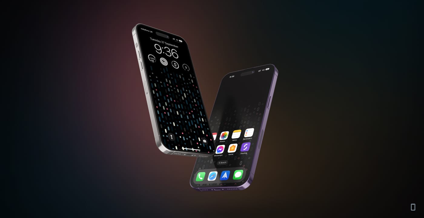
Take your iPhone's lock screen to the next level with this minimal wallpaper. It makes sure that the icons of your installed apps are the focus on your home screen while having a clean look on your lock screen.
A couple of weeks have passed since I installed iOS 16 on my phone, and like many people are saying, the most notable part of this release is the new lock screen. I love the customization options it offers and the depth effect that can be added to any photo so effortlessly! Apple always kills it with their wallpapers, and the new Astronomy one is no different! The sleek animation between the lock and home screens is amazing, and the active dot on Earth that indicates your current location is a brilliant detail. But I'm never fully satisfied with the default offerings of any operating system, regardless of how good they are. 🤷♂️
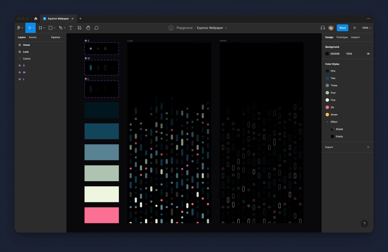
It's been 5 months since I created my previous wallpaper colors, and it's still the default background on all of my devices. Even though it wasn't necessary, I felt that my new iPhone 14 Pro deserved a small UI upgrade. As always, I'm a big fan of dark-colored wallpapers and as minimalistic as possible. This time, rather than using Pixelmator Pro, I decided to have some fun and experiment with Figma. With vectors and components, I wanted to see what effect one change would have on my wallpaper as a whole.

Several explorations later, I came up empty-handed. So I gave up and joined a video chat with my good friend Stefanos. We frequently exchanged design ideas through brainstorming, and it was his previous work on a comparable wallpaper that inspired my new concept! The idea came to me in a sudden moment of clarity, and all that was left to do was put it into action.
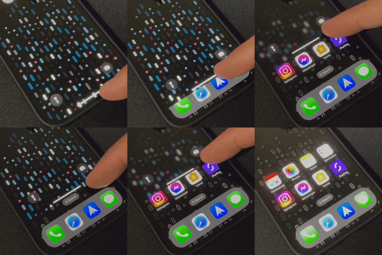
Back to Figma, and now the concept was much more apparent. I needed to create two types of wallpaper: one for the lock screen and another for the home screen. In iOS 16, there is a different transition between these two screens than in earlier versions, which helped me refine my concept. It took several iterations, but eventually, I arrived at a design with three components and four variants each. I used six colors total, and the effect I was going for was a transition from the lock screen to the home screen that kept the same wallpaper but in a different, dimmed style.

Introducing Equinox, the new iPhone wallpaper that's sure to make an impression! Equinox is a wallpaper design for the Pro and Pro Max iPhones that consists of two separate images meant to be used on the Lock and Home screens. When you unlock your phone, the combination of the two produces a subtle transition effect that shifts the focus to your app icons while gradually fading out the wallpaper elements. It's a small detail, but it's one that I think really makes a difference in the overall look and feel of your phone. Plus, it's just really cool to see in action. If you're someone who likes to keep up with the latest trends in iPhone design, Equinox is definitely worth checking out.
What about the iPad?
Once I was happy with how the new wallpaper looked on my iPhone, I started experimenting with larger versions of it that could work on the iPad and even on a Mac. However, there are certain things on the iPad's home screen that don't align the way I want them, and this kind of wallpaper doesn't look as good. I may return to my ideas and bring Equinox to the iPad and Mac, but for now, this wallpaper is only available for the iPhone.